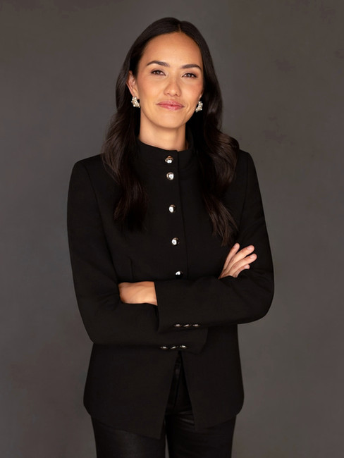
SHOULD MY LINKEDIN PROFILE PICTURE BE IN COLOR OR IN BLACK AND WHITE?
- Alice Prenat
- Feb 24
- 4 min read
Updated: 4 hours ago
The short answer is simple: there is no absolute right or wrong choice.
But there is a choice that will be more relevant depending on your personal brand, your industry, and the message you want your portrait to convey.
Does it really matter ? What are the pros & cons for each ?
Discover straight-to-the-point guidance below to make an informed choice.
These executive portraits were photographed by NYC headshot photographer Alice Prenat, specializing in high-end executive headshots in New York City.
INTERACTIVE TABLE OF CONTENT
1 - VARIABLE #1 : CONTEXT OF THE USE OF YOUR PORTRAITS
Your professional executive portrait is like your own marketing tool.
And when we say ‘marketing’, it should absolutely be aligned with the audience you are addressing.
Then the question you have to ask yourself
before choosing a professional headshot in colors or in black and white is:
WHO IS THE TARGET AUDIENCE I AM ADDRESSING ?
For instance, if you use your corporate headshot on Linkedin because you are in search of a position in the luxury industry, or if you are using your portrait on your website because you just launched a very innovative high tech project… these are very different objectives.
Black and white portraits often work well in:
Law
Finance
Luxury industries
Consulting or traditional executive environments
Artistic environment
Black and white images feel timeless, elegant, and authoritative.
These executive portraits were photographed by NYC headshot photographer Alice Prenat, specializing in high-end executive headshots in New York City.
Color portraits often work best in:
Marketing
Communication
Tech
Healthcare
Entrepreneurship
Color tends to feel more modern, approachable, and dynamic.
These executive portraits were photographed by NYC headshot photographer Alice Prenat, specializing in high-end executive headshots in New York City.
2 - VARIABLE #2 : WHAT ENERGY YOU WANT TO CONVEY ?
There is also an emotional dimension to the choice.
Color psychology shows that colors influence how people perceive us and how they feel about us.
When you choose a black and white portrait, the message is usually centered around:
Elegance
Authority
Sophistication
Simplicity
But it will also remove the emotional signals carried by color.
When you choose a color portrait, you can communicate additional elements such as:
Warmth
Energy
Trust
Creativity
Color images can feel more natural because people experience the world in color, which can make the portrait feel more relatable and engaging online.
CONCLUSION
In other words:
The right choice depends on
the professional story you want your image to tell.
FAQ
Is a black-and-white LinkedIn photo professional?
Yes, a black-and-white LinkedIn photo can look very professional. It often conveys elegance, authority, and timelessness. This style is commonly used by professionals in industries such as law, finance, consulting, and luxury sectors where a classic visual style fits the brand.
Does a black-and-white LinkedIn profile picture stand out more?
Sometimes. Because most LinkedIn profile photos are in color, a black-and-white portrait can stand out visually in search results or comment threads. However, the image still needs to feel warm and professional. Standing out only helps if the portrait also communicates credibility.
Is it OK to use an AI generated headshot on Linkedin instead of a real photo ?
Technically, yes. For someone who doesn’t know you personally, it can be difficult to immediately tell whether a LinkedIn photo was generated by AI or taken by a photographer.
The deeper question though is actually not whether others can tell.
The real question is:
How do you want to feel about yourself when you use and look at your photo?
AI headshots are created by generating images based from millions of other photos found online. The result may look neat, but it is ultimately a synthetic counterfeit version of you, not the real you.
A professional headshot, on the other hand, captures the real person people will meet — It conveys your real expression, your charisma and presence, and your personality.
And that difference matters psychologically: The image you choose to represent yourself actually do influence how you feel about yourself.
It is exactly like luxury brands (handbags, watch): A counterfeit product may look similar from a distance, but the experience of owning & wear the real one is different. The value is not only in how it looks — it is in what it represents and how it make you feel.
Do you prefer to feel real or fake ?
A real professional headshot can serve as a reminder of your confidence, credibility, and personal value. And that feeling often matters more than the image itself.
ABOUT THE AUTHOR: ALICE PRENAT, TOP NYC PORTRAIT PHOTOGRAPHER

Alice Prenat is the sought-after NYC photographer you want to get photographed by: the excellence of her craft mixed with her big warm personality & french accent gets her to create the type of portraits of yourself or executive headshots that you most probably haven't seen before.
You won't walk out of her studio feeling the same way than you came in:
she curates a safe & very empowering portrait experience
that will truly impact the way you feel about yourself.
Alice takes a limited number of clients per month, you can inquire here.
All executive headshots & CEO portraits of this article were created by Alice Prenat either at her portrait studio in NYC, in Paris or on locations.


